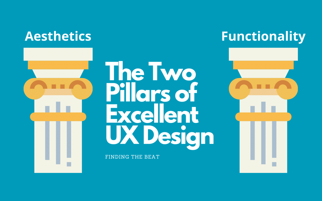
There are two pillars in all user interface designs. They are the mortar and bricks. They support the integrity of the whole design structure. What are they? Aesthetics and Functionality! One without the other is like having tennis shoes without tying your shoelaces! Sure, your feet are protected, but you’re constantly tripping over yourself!
Functionality

Ok, this may seem obvious, but the bottom line is your product has to work. This seems like a simple statement on the surface. But in reality, us people are really talented at completely breaking computers and their programming. Why is that? Well here is the thing. Humans don’t think like computer programs. Computer programs ingest very specific instructions and then spit out very specific results based on those instructions.

For example, if you had a computer program that could provide you a quick summary of Abe Lincoln’s history, you would receive the exact same history in the exact same way every time. Now ask three different humans to do the same thing. Or just ask the same human three times (preferably not a docent at a history museum). You will get vastly different sentence structure, length, depth of knowledge, etc. Humans think organically. We skip and jump and hop around a multitude of logical and illogical paths. Computers don’t.
Ok, so it is obvious humans and computers process information differently. Not only that, individual humans process information differently based on their unique experiences and cultural training. It is easy to see how a human could inadvertently give incorrect instructions to a computer program. And if your program can consume incorrect instructions in any way, it isn’t functional.
So how do you connect the dot from all these individual humans and their possible responses to this ONE interface? How do you ensure your program is functional? It’s not easy, but here are some ideas to get you rolling.
- Make sure all user inputs are validated by your product. For example, don’t even allow the possibility for a user to put a letter into a number field.
- Provide a way to back out of any changes/updates a user can make in your product.
- If a user can commit permanent changes, ensure there is an “Are you sure?” stop gap method.
- Pre-fill as much information as you can.
- Put your product in front of a few people and give them instructions to purposely try to break it. This is so important. If any of your testers can break it in any way, you can bet someone will accidentally do the same thing in the future.
Aesthetics

Ok, now that we are past the obvious pillar of functionality, let’s focus on the wild world of aesthetics! For those of you who love to draw, have an invested interest in photography or fashion, or simply enjoy beautiful things – this is the section for you! And if none of those things are your jam, this may be a struggle. But never fear! A lot of your cultural training can be put to good use!

Every day we are constantly bombarded with design. Just look around! The computer, phone, chairs, door handles, walls, clothes, just everything is designed by us for us! And all this information is processed in our brains (whether we know it or not). Have you ever looked at a piece of clothing and immediately reacted (with no thought to it), “My god, that is hideous! I would never wear a thing like that!” Well, that is your cultural training at work. And believe it or not, those knee jerk reactions are gold when judging the “aesthetics” of your design.
Personal and company style plays a huge role in design. So I can’t give you any “do this” statements. But I can give you some psychological reasons to avoid or gravitate towards certain things.
- Avoid using more than five colors. I’ve found three colors to be to my liking. It gives enough variety in the design without overloading your sense.
- Use readable font for anything your user needs to…read. Your logo, go crazy with the curly cues! Your instructions, keep it simple!
- Curvy things are aesthetically pleasing to our human brains. However it is hard for us to compare one curvy thing to another curvy thing. So here are my rules regarding curves.
- If you’re just going for looks and not trying to show any analytical information, use those curves!
- If you are showing metrics and trying to compare one thing to another, use straight lines!
- Use bright colors to draw attention. Just be warned if you are using bright colors all over the place, the effect is diminished.
- Use dull colors (like gray) to signify unimportance.
- Follow your feelings. If you hate it, others will probably hate it too. If you love it, that’s a good sign.
The Yin with the Yang, a Delicate Balance to Excellent Design

Over the years as I’ve built products for others to use, I’ve found project goals tend to focus on only one pillar. You’ve probably guessed it already. Have you ever heard someone say, “As long as it works, it doesn’t matter how pretty it is!” That’s right, you’ve guessed it! Often times we developers tend to completely ignore aesthetics for the utilitarian viewpoint of functionality is king. And while ultimately your goal is for the product to work, you also need people to use the dang thing. That is where aesthetics come in.
Aesthetics creates a sense of “joy” in your user. If something is just plain ugly, it doesn’t really inspire a desire to be utilized. It is often viewed as a chore or necessity. You don’t want your users to feel that way when using your product. In addition to creating a pleasant experience for your user, you are also cultivating a professional reputation. Products that work AND look nice are the talk of the town! Believe me, I’ve had multiple managers be pleasantly surprised at how much they’ve enjoyed using my products because they looked nice. They weren’t wowed by functionality (because after all if it doesn’t work you’ve failed).
On the flip side, if you focus on just aesthetics, you’ve completely missed the point of delivering value in your product. Just being pretty doesn’t get things done. The marriage between functionality and pleasant wrappings is your path to success!
Now go forth, and be amazing! Take these concepts and see what you can make of them! And if you have additional advice, feel free to comment below!
Spread the love

